#Displayfail: Massive In-Store Display Mistakes
by

If there’s one skill you need in order to be an effective merchandiser, it’s attention to detail. Take for example, the classic in-store display. On the surface, they seem simple enough to manage. But far too often, we see massive in-store display mistakes, or to use the 2020 lingo, a #displayfail. This really bothers us because mistakes like these are so easy to avoid.
They’re also costly. At a time when retail is fighting against an unprecedented number of hurdles—coronavirus, online shopping—retailers and merchandisers need to work extra hard to create a space where customers want to shop. Elegant, visually enticing in-store displays can go a long way towards establishing the type of ambience conducive to return visits.
The truth is, displays are one of the most critical aspects of a retail space—and absolutely essential for merchandisers to get right. When you realize that as much as 70% of retail purchases aren’t decided until the customer is actually in the store, the full importance of the in-store display comes into clear view.
When done effectively, displays can serve as a powerful showcase for merchandise, and create a more desirable in-store experience for shoppers. On the flipside, poor management of in-store displays can create a confusing, unpleasant shopping experience. Unpleasant shopping experiences lead to less customers. Less customers lead to unhappy merchandising clients.
So, you can see how much is riding on effective in-store display design. Let’s take a look at some of the top display fails, and how to avoid them.
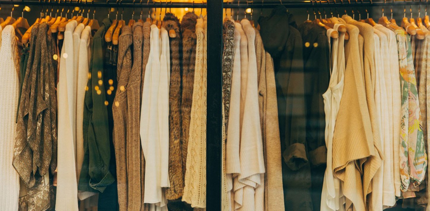
Poorly Lit Merchandise: The right lighting can create a dramatic effect in a retail space, bringing out the best in the merchandise. But under lit, murky displays can cause customers to pass right by your display without giving it a second’s thought.
Distracting Signage: We realize that lots of the time, signage and other display decisions come from corporate headquarters. However, it’s helpful if you can spot—and fix—mistakes when you see them. A great example is distracting signage. Aggressive, overly large signage will make your space look cluttered and disorganized. It also detracts from your product, confuses your customers and creates an unpleasant atmosphere…exactly what you don’t want.
Crowded Display Shelves: In retail, less is often more. That goes double for display shelves. Crowded display shelves can quickly go from crowded to downright sloppy in minutes. Instead of cramming in product, give high-margin merchandise plenty of breathing room up front, then group the rest of your inventory together by department for a more organized, pleasant experience.
Uninspired Displays: Sometimes, the worst thing to be in retail is boring. If the displays are blah, that’s probably how customers will feel about the entire store. Take the time to show off merchandise on displays that make an impact. The blog compliant IA has an excellent post about how to create more visually inspiring displays.
Forgetting Seasonality: Seasonality is something that every merchandiser and retailer should embrace. People are more likely to share your displays on social media (in a good way) if they’re tied into the current season, whether it’s the middle of July, Halloween, or the Holiday season.
Hidden Products: When online shopping can deliver virtually anything you can think of to your door, merchandisers need to ensure that products are easy to find, all the time. Confusing, disorganized in-store displays that make shoppers do too much work to find products are an obvious #displayfail. Keep displays clean and decluttered. A less-is-more approach is the way to go.
Traffic Flow: By definition, your displays are going to occupy a prominent space in the retailer’s establishment. Make sure it doesn’t interrupt the traffic flow of the store. Think about customers with special needs and strollers. Will they be able to easily navigate in the space, or will large, bulky display be disruptive? Look for streamlined options that aren’t too wide, or jut out into the aisle footpath.
Is there a #displayfail we left out? Let us know other ways that an in-store display has detracted from the look, feel, or flow of a retail space.